DIVINITY SANS
A downloadable typeface
this is a typeface i have been making, inspired by the actual play podcast Friends at the Table's "Partizan" season. Partizan is a sci-fi mech show about a horrific empire – the Divine Principality – at war with itself, massive robots, and our ability to imagine better worlds. it combines technological marvels that approach the mythological with gritty, lo-fi realities. the vibe is a combination of medieval fantasy and original trilogy Star Wars. i really, really love it, and cannot recommend it highly enough!
various fan-works have tapped illuminated manuscripts as points of reference (see: Annie Johnston-Glick's fantastic maps). the idea of a typeface in that style resonated with me, and i figured it would be a "fun weekend project." it was not a "fun weekend project."
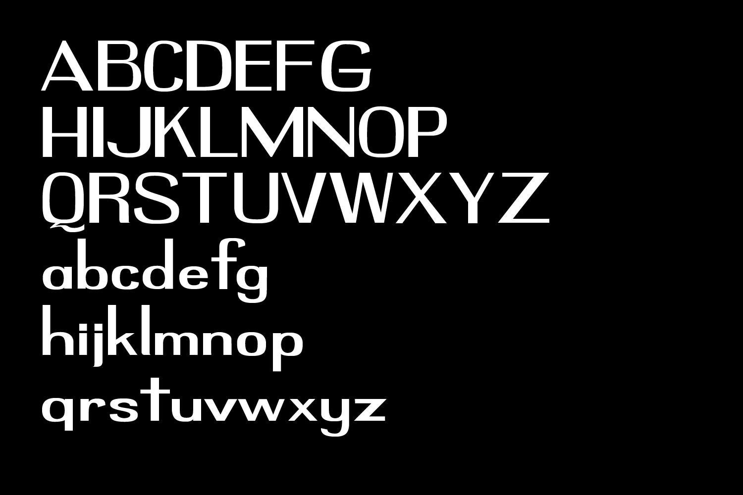
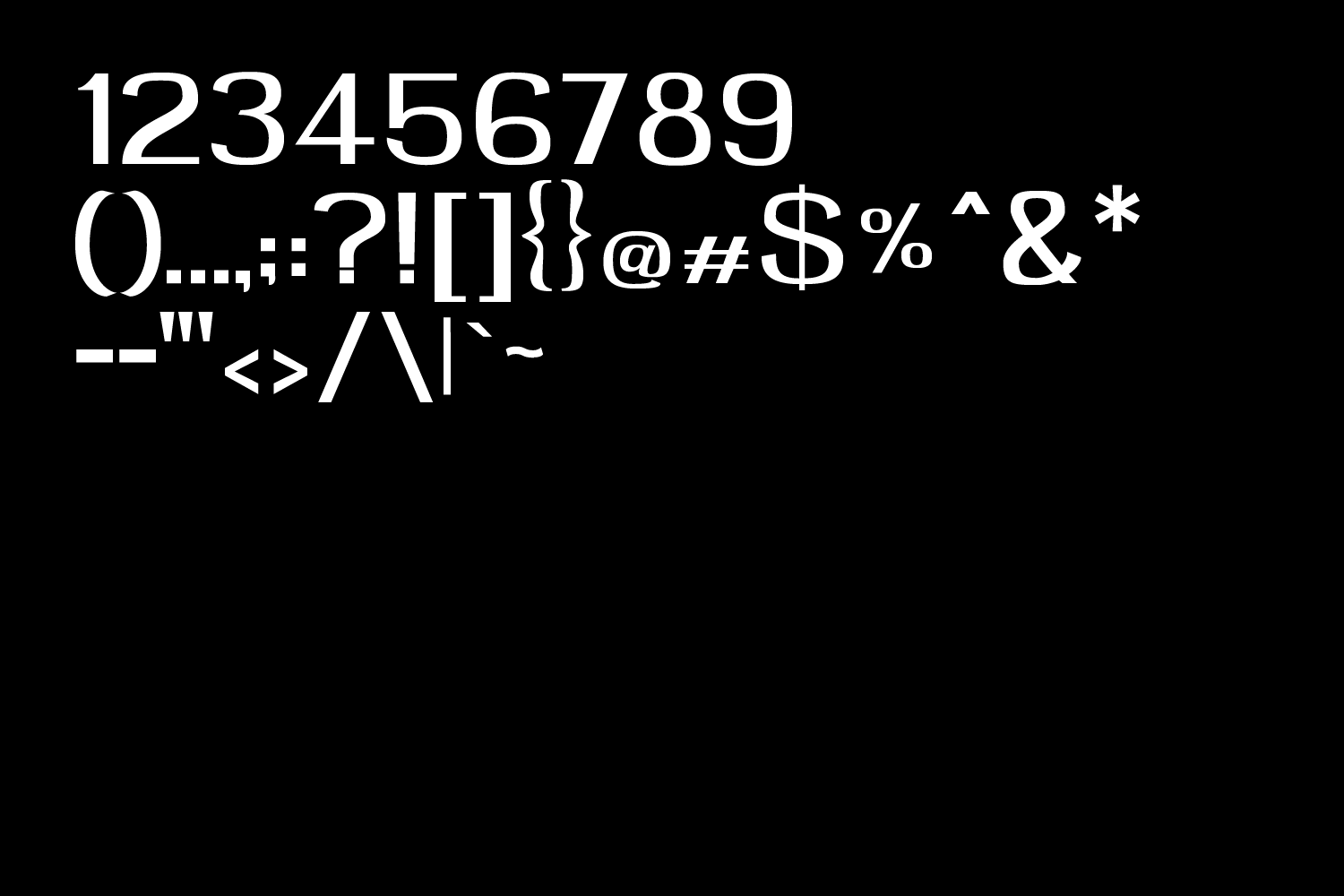
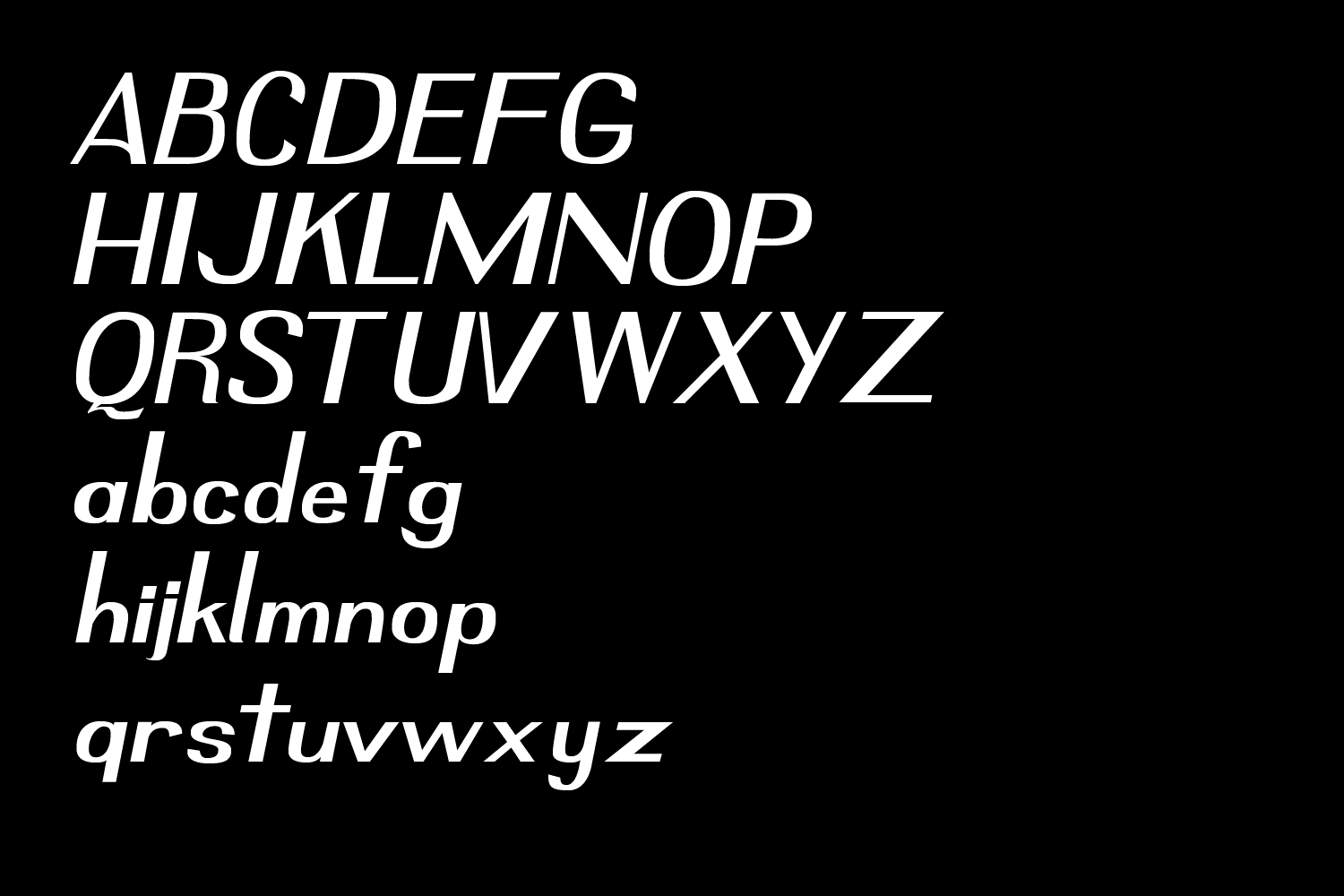
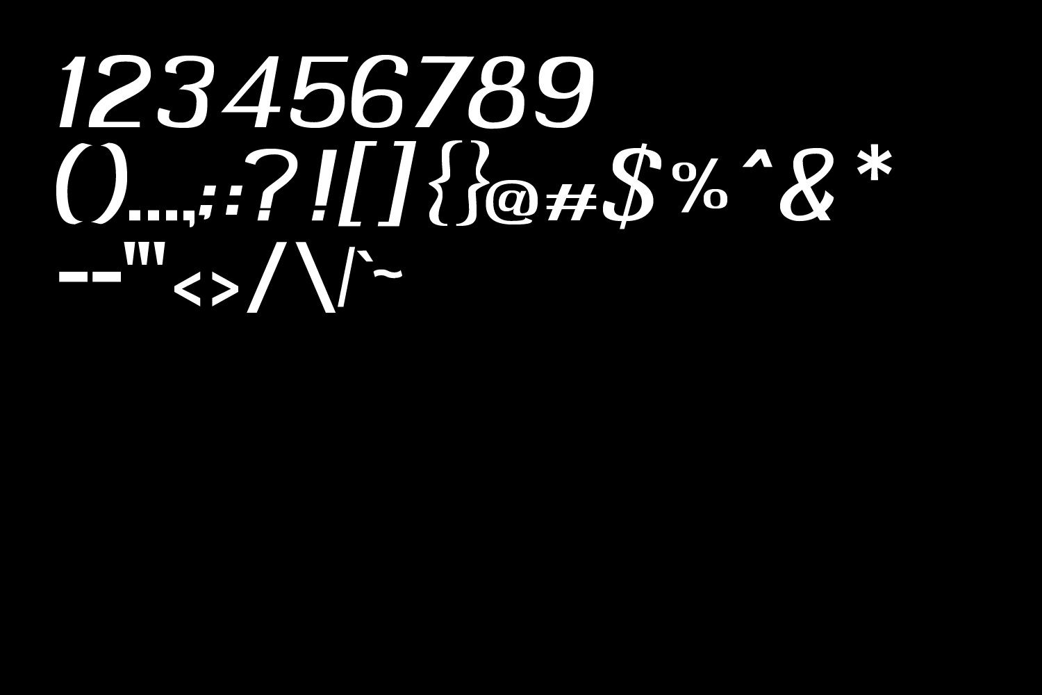
two months later, Divinity Sans is here. it combines calligraphic contrast with minimalist restraint and cynicism. it includes both Regular and Italic variants. it is an open type font format. this is my first full typeface, so the hinting isn't great – it really works better as a display font. some day i hope to revisit this and update that.
like you probably saw, you can download it for free! no licenses or whatever, just go make some cool stuff. maybe send it to me? i'd love to see it.
you can find more of my design work at: www.fischermade.xyz
(and really i do urge you to go listen to Friends at the Table its so great)
updates:
- 1_26_2021 – version 1.1 – revised the kerning in both styles, added .ttf format
Download
Install instructions
i recommend downloading the version labelled TTF unless you specifically need an OTF file. whichever you pick, you will be able to download the .zip file. unzip it and the fonts should install straightforwardly.
Development log
- DIVINITY SANS 1.1 update!Jan 27, 2021
Comments
Log in with itch.io to leave a comment.
Hello! I used your font in my game "Eeris Hotel", if you want to check it out! Thanks a lot for your awesome work, keep it up!!
Hello!! I love this font! I just used it for the new Palisade map! Full circle!!
Why is the TTF version suggested over the OTF version?
so, i've noticed the OTF version behaves kind of weirdly at smaller sizes in certain situations. i believe it is something to do with how the formats handle hinting and aliasing, which i am still wrapping my head around.
here's an example of the same text in the two formats with 12pt text, rendered as a .PNG from Illustrator. i really notice it on, say, the "c" and "e" in the OTF version: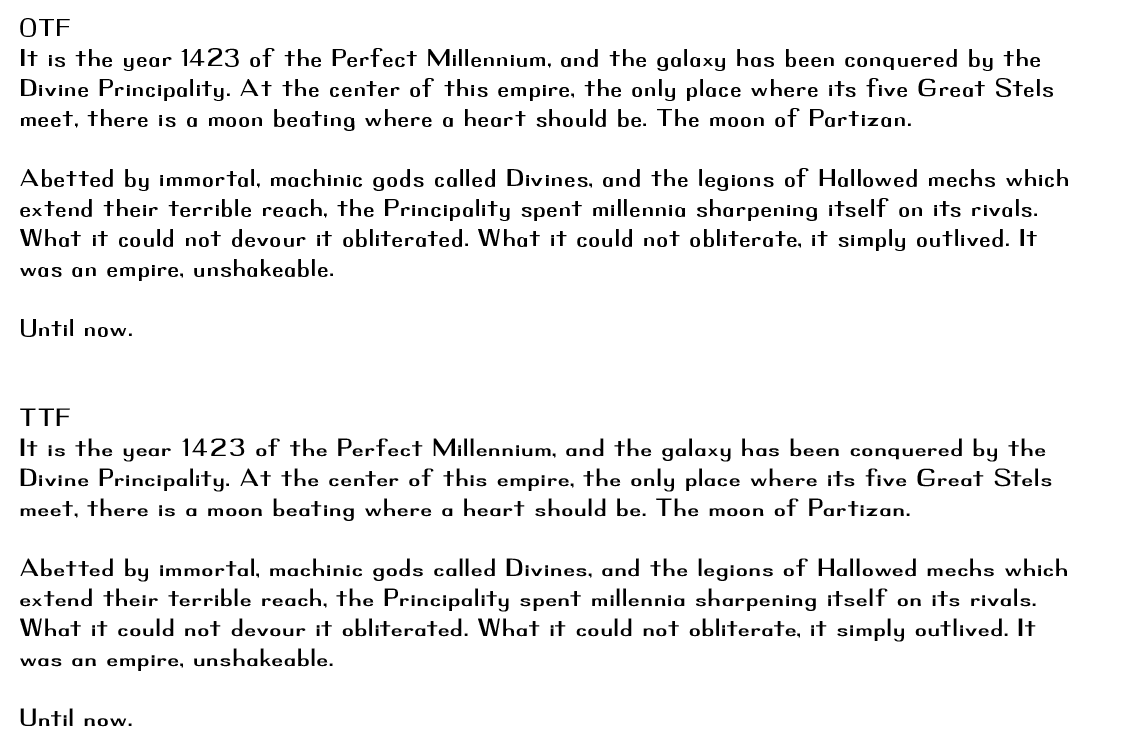
but then, Pages handles both of them without any problem. here's a screencap of the same text, same size, exported to .PDF from Pages.
i have heard there can be some printing situations where OTF is preferable, so i included it. but my rule of thumb for this typeface would be that TTF is probably just fine unless you specifically know you want an OTF version.
i hope that helps, let me know if you have other questions.
Thanks! I plan on using it with XeTeX, which supports both TrueType and OpenType, and typographic features from AAT, OpenType, and Graphite. I'll have to experiment and see if there are any differences in the hinting.
oh excellent. i still need to learn a lot about a lot of the technical side of making typefaces, hopefully once i know more i can put out a revision that fixes whatever's up. and, i'm excited for whatever you end up using it for!
absolutely love it, but the regular otf file seems to contain the italics font as well :)
ah! thanks for the heads up. this is my first typeface i've ever actually released – when i update this, i'll make sure to sort that out. and thanks for the kind words!
no worries! it really is a gorgeous typeface, thank you so much for creating it.